The Guide to Kitchen Cabinet Colours: From Timeless Neutrals to Bold Statements
The complete guide to picking the perfect paint colour for your kitchen cabinets. Discover how light, room size, and style can help you choose a beautiful shade.
This post may contain affiliate links. If you make a purchase through these links, we may earn a commission at no additional cost to you.
Choosing the right colour for your kitchen cabinets can feel like a massive decision. And in many ways, it is. The kitchen is the heart of the home, a place where we cook, eat, chat, and make countless cups of tea. The colour of your cabinets sets the tone for the entire space, influencing everything from the mood to how big the room feels. Get it right, and you’ve created a space you’ll love for years. Get it wrong, and you’re stuck with a kitchen that just doesn’t feel… you.
But don’t worry. This isn’t a decision you have to make in the dark. Think of this guide as your friendly expert, here to walk you through everything you need to consider. We’ll explore the psychology of colour, look at how the size and light in your kitchen play a huge role, and dive into the most popular colour families—from calming neutrals to dramatic darks. Whether you live in a cosy Cotswold cottage or a sleek London flat, we’ll help you find the perfect hue that looks brilliant and works for your lifestyle.
So, grab a biscuit, settle in, and let’s talk colour. By the end of this, you’ll have the confidence to pick a shade that transforms your kitchen from just a room into the true heart of your home.
Part 1: Understanding the Foundations of Kitchen Colour
Before you start sticking paint swatches to your cabinets, it’s worth taking a step back. A little bit of planning and understanding at this stage will make the final decision much easier and far more successful. We need to think about the ‘why’ before we get to the ‘what’.
The Psychology of Colour: How Hues Affect Your Mood
Colours aren’t just for looking at; they make us feel things. This is colour psychology, and it plays a huge part in creating the right atmosphere in your kitchen.
- Warm Colours (Reds, Oranges, Yellows): These are energetic, cheerful, and appetite-stimulating colours. A splash of a warm colour can make a kitchen feel welcoming and sociable. A full-on bright orange might be a bit much for a whole kitchen, but a muted terracotta or a warm, buttery yellow can be incredibly inviting. They’re perfect for creating a cosy, happy hub for the family.
- Cool Colours (Blues, Greens, Violets): These shades are calming and serene. They make us think of nature, water, and wide-open skies, which can bring a sense of peace to a busy space. A soft sage green or a deep navy blue can make a kitchen feel tranquil and sophisticated. They are fantastic for creating a calm oasis away from the hustle and bustle of daily life.
- Neutrals (Whites, Greys, Beiges, Greiges): Neutrals are the dependable friends of the colour world. They are timeless, versatile, and create a clean, fresh backdrop. White can make a space feel bigger and brighter, while grey can feel modern and chic. Beige and its trendy cousin, ‘greige’ (a mix of grey and beige), offer warmth without being overpowering. They provide a brilliant canvas that allows other elements, like your worktops or a colourful splashback, to shine.
Think about the mood you want to create. Do you want your kitchen to be a vibrant, energetic space for lively family dinners? Or a calm, relaxing haven for quiet morning coffees? Your answer will start to point you towards a specific colour family.
Light and Space: Your Kitchen’s Two Best Friends
The amount of natural light your kitchen gets and its physical size are two of the most important factors in choosing a cabinet colour. A colour that looks stunning in a bright, spacious showroom can look completely different in a smaller, north-facing kitchen.
The Role of Natural Light
The direction your kitchen faces dramatically affects how colours appear throughout the day.
- North-Facing Kitchens: These rooms receive cool, indirect light for most of the day. This light has a blueish tint, which can make cool colours feel colder and a bit sterile. To counteract this, consider choosing colours with warm undertones. Think creamy whites instead of brilliant white, or a warm grey rather than a cool slate grey. A soft, warm green or even a muted yellow can work wonders to bring warmth and life to the space.
- South-Facing Kitchens: Lucky you! These kitchens are flooded with warm, bright light all day long. Almost any colour will work here. You can embrace bold, dark colours like navy or forest green without the room feeling gloomy. Cool blues and crisp whites will look fantastic and help to balance the intensity of the sunlight, creating a fresh and airy feel.
- East-Facing Kitchens: These rooms get lovely bright light in the morning, which becomes cooler as the day goes on. A great strategy is to choose a colour that looks good in both conditions. Soft blues and greens can look wonderfully fresh in the morning sun and remain calming in the afternoon. You can also use a colour that subtly changes its character, which can be quite magical.
- West-Facing Kitchens: These kitchens are cooler in the morning but are bathed in a warm, golden glow in the late afternoon and evening. This warm evening light can make colours look richer and more intense. Whites and light neutrals will bounce this light around beautifully. Earthy tones and warmer greens will also come alive in the evening, creating a cosy and inviting atmosphere for dinnertime.
Top Tip: Always test your paint samples in your own kitchen. Paint a large piece of card (at least A4 size) and move it around the room at different times of the day. See how it looks in the morning light, at midday, and in the evening under your artificial lights. This is the only way to be sure you’ll love the colour in your own unique space.
Size Matters: Making Your Kitchen Feel Bigger or Cosier
The colour you choose can visually alter the perception of your kitchen’s size.
- For Small Kitchens: Light colours are your best friend. White, cream, light grey, and pale pastels are brilliant at reflecting light, which makes a space feel bigger, brighter, and more open. A uniform colour scheme, where the cabinets, walls, and splashback are similar light shades, can further enhance this effect by blurring the boundaries of the room. If you love colour, consider painting just the lower cabinets in a darker shade and keeping the upper cabinets light. This technique, known as ‘tuxedo cabinets’, draws the eye upwards and creates an illusion of height.
- For Large Kitchens: If you have a large, open-plan kitchen, you have more freedom to be bold. Dark and dramatic colours like charcoal, navy, or deep forest green can look incredible and help to make a large space feel more intimate and grounded. These colours absorb light, which can create a cosy and sophisticated atmosphere. You can also use colour to ‘zone’ the space. For example, painting a kitchen island in a contrasting bold colour can make it a stunning focal point and visually separate the cooking area from the dining or living space.
Considering Your Home’s Architectural Style
Your kitchen doesn’t exist in a vacuum. The style of your home should influence your cabinet colour choice to ensure a cohesive look.
- Traditional and Country Homes (e.g., Victorian terraces, farmhouses): These homes often suit classic, heritage colours. Think of shades from brands like Farrow & Ball or Little Greene. Creamy whites, soft sage greens, duck egg blues, and muted greys work beautifully with traditional features like Shaker-style cabinets, Belfast sinks, and wooden worktops. These colours feel authentic and timeless.
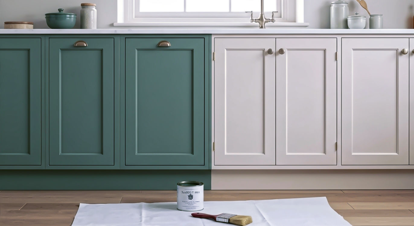
- Modern and Contemporary Homes (e.g., new-builds, minimalist apartments): Clean lines and uncluttered spaces are the hallmarks of modern design. This style can handle a wider range of colours. Crisp whites and cool greys create a sleek, minimalist look. But modern kitchens are also the perfect canvas for a bold statement. A block of a single, vibrant colour—like a cobalt blue or a zesty lime green—can look stunning against simple, flat-panelled cabinets. Two-tone kitchens, with one colour for the base units and another for the wall units, are also very popular in modern design.
- Period Properties (e.g., Georgian townhouses, Edwardian villas): These homes have a certain elegance and grandeur. Your colour choice should respect that. Deep, rich colours like navy, racing green, or even a sophisticated burgundy can add a touch of drama and luxury that complements high ceilings and ornate plasterwork. On the other hand, a carefully chosen off-white or a classic light grey can provide a timeless backdrop that lets the period features sing.
Think about the overall feel of your house. Is it rustic and cosy, or sleek and modern? Choosing a cabinet colour that aligns with this will create a kitchen that feels like it truly belongs.
Part 2: A Deep Dive into Colour Families
Now that we’ve covered the fundamentals, let’s explore the most popular colour families in detail. We’ll look at the pros and cons of each and offer some inspiration for how to use them.
The Appeal of White and Off-White Kitchens
White kitchens are eternally popular, and for good reason. They are timeless, versatile, and have a magical ability to make any space feel bigger and brighter.
- Why We Love Them: A white kitchen is a blank canvas. It’s clean, fresh, and will never go out of style. It allows you to easily change the look of your kitchen over time with accessories, textiles, and different wall colours. It also appeals to a wide range of tastes, which is a great bonus if you might sell your home in the future.
- Choosing the Right White: Not all whites are created equal.
- Brilliant White: This is a pure, crisp white with no undertones. It’s perfect for creating a sharp, ultra-modern, minimalist look. However, in a north-facing room, it can feel a bit clinical or cold.
- Off-Whites and Creams: These whites have warm undertones (yellow, pink, or beige). They feel much softer and more welcoming than brilliant white. Think of shades like Farrow & Ball’s ‘Wimborne White’ or Little Greene’s ‘Slaked Lime’. They are perfect for traditional or country-style kitchens and are more forgiving in rooms with cool natural light.
- Things to Consider: The main drawback of a white kitchen is maintenance. White cabinets will show every fingerprint, splash, and crumb. If you have young children or pets, you might find yourself constantly wiping them down. You can mitigate this by choosing a finish with a slight sheen (like eggshell or satin), which is easier to clean than a flat matt finish.
- How to Style It: To stop a white kitchen from feeling bland, it’s all about adding texture and contrast.
- Worktops: A wooden worktop will add warmth and a rustic touch. A dark granite or quartz worktop will create a striking, classic contrast.
- Hardware: Brass or copper handles and taps can add a touch of glamour and warmth. Black or pewter hardware creates a more industrial or modern look.
- Splashback: This is your chance to inject personality. A colourful tiled splashback, a sheet of patterned glass, or even a textured stone can become a beautiful focal point.
The Sophistication of Grey Kitchens
Grey has been the go-to neutral for years, and its popularity isn’t waning. It’s more complex than white and can be used to create a huge range of styles, from calming and serene to dramatic and moody.
- Why We Love Them: Grey is incredibly versatile. It can act as a quiet, sophisticated backdrop or be the star of the show. It pairs beautifully with almost any other colour, giving you endless options for walls, floors, and accessories.
- Finding Your Perfect Grey: The undertone is key.
- Warm Greys (Greiges): These have yellow or brown undertones, like Farrow & Ball’s famous ‘Elephant’s Breath’. They feel earthy, calming, and cosy. They work well in north-facing rooms and pair beautifully with natural materials like wood and stone.
- Cool Greys: These have blue or purple undertones, like a classic slate or charcoal grey. They feel crisp, modern, and formal. They are perfect for creating a sleek, contemporary look, especially in south-facing rooms with plenty of light.
- Things to Consider: A common mistake is choosing a grey that’s too cool for a room with little natural light, which can make the space feel drab and unwelcoming. As with white, always test your chosen grey in your kitchen first. A large grey kitchen can also sometimes feel a bit one-dimensional, so it’s important to add warmth and texture.
- How to Style It:
- Add Warmth: Introduce elements of wood through your worktop, flooring, or open shelving. Brass hardware is also a fantastic way to warm up a cool grey scheme.
- Pair with Colour: Grey is a brilliant partner for other colours. A pale grey kitchen can be brought to life with a pop of colour on a splashback or a feature wall. A dark charcoal grey looks incredibly sophisticated paired with a soft, dusky pink or a rich mustard yellow.
- Mix and Match: Consider a two-tone scheme with a darker grey on the base units and a lighter grey or off-white on the wall units. This can add depth and interest to the design.
The Drama of Black and Dark Kitchens
Once considered a daring choice, dark kitchens are now a mainstream trend. A kitchen with black, navy, or deep green cabinets makes a powerful and sophisticated statement.
- Why We Love Them: Dark kitchens exude a sense of luxury, drama, and intimacy. They are bold, confident, and surprisingly cosy. They are also brilliant at hiding minor scuffs and marks, making them a practical choice.
- Popular Dark Shades:
- Navy Blue: This has become a modern classic. It’s softer than black but still offers plenty of drama. It feels timeless and sophisticated and pairs beautifully with white marble-effect worktops and brass hardware for a touch of glamour.
- Forest Green or Racing Green: Deep greens are calming and connect the kitchen to the outdoors. They feel elegant and heritage-inspired, especially in a traditional Shaker style. They look wonderful with wooden accents and warm metals.
- Charcoal and Off-Black: A true black kitchen can be intense, but a slightly softer charcoal or off-black can be more liveable. These shades are perfect for an industrial or ultra-modern look, especially when paired with concrete-effect worktops and stainless steel.
- Things to Consider: The biggest challenge with a dark kitchen is ensuring it doesn’t feel like a cave. Good lighting is non-negotiable. You’ll need a combination of ceiling lights, under-cabinet lighting, and perhaps pendant lights over an island or dining area. Dark colours work best in medium to large kitchens or in rooms with plenty of natural light. In a very small kitchen, a dark colour can feel overwhelming.
- How to Style It:
- Balance with Light: Contrast is key. Pair dark cabinets with a light-coloured worktop and splashback to bounce light around the room. A light-coloured floor will also help to lift the scheme.
- Embrace Texture: A matt finish is very popular for dark cabinets as it absorbs light and has a velvety, luxurious look. Contrast this with glossy tiles, reflective metallic hardware, and natural textures like wood or stone to add depth and interest.
- Metallic Accents: Brass, copper, and gold hardware and taps look stunning against dark cabinets, adding a warm, reflective quality that prevents the scheme from feeling flat.
The Calm of Green and Blue Kitchens
Inspired by nature, green and blue are calming, restorative colours that can turn your kitchen into a tranquil retreat.
- Why We Love Them: These colours have a timeless appeal and a strong connection to the natural world. They can make us feel peaceful and grounded, which is a wonderful quality in a busy family kitchen.
- Shades to Explore:
- Sage Green: A soft, grey-toned green that is incredibly popular. It’s calming, earthy, and works in both modern and traditional kitchens. It pairs beautifully with white, wood, and brass.
- Mint Green: A fresher, more playful green that’s great for adding a retro or Scandi-inspired touch.
- Duck Egg Blue: A classic, pale blue with a hint of green. It’s light, airy, and perfect for creating a coastal or country cottage feel.
- Deep Teal or Peacock Blue: If you want something bolder, these rich blue-green shades are dramatic and jewel-like. They make a fantastic statement, especially on a kitchen island.
- Things to Consider: Like all colours, the undertone matters. A blue with a lot of grey in it will feel more sophisticated and muted, while a blue with a hint of violet will feel more energetic. Always consider the natural light in your room. A beautiful sage green can look a bit sludgy in a dark, north-facing kitchen unless it’s well-lit.
- How to Style It:
- Natural Partners: These colours are a natural fit with organic materials. Think oak worktops, stone flooring, linen blinds, and plenty of houseplants.
- Hardware Choices: Brushed nickel or chrome hardware gives a fresh, modern look against blues and greens. For a warmer, more traditional feel, opt for aged brass or pewter.
- Worktop Pairings: Crisp white or light grey quartz worktops create a clean, contemporary contrast. A warm, honey-toned wood will create a more rustic, down-to-earth vibe.
The Energy of Warm and Bold Colours
If neutrals feel a bit safe for you, why not inject some personality with a bold, warm colour? Think deep reds, sunny yellows, or even a playful pink.
- Why We Love Them: A colourful kitchen is a happy kitchen. These shades are full of energy and personality. They can make a kitchen feel warm, welcoming, and uniquely yours.
- How to Use Them Wisely: A whole kitchen in a very bright colour can be overwhelming and might date quickly. The key is to use them strategically.
- Feature Island: Painting just your kitchen island in a bold colour is a fantastic way to create a focal point without committing to the colour everywhere.
- A Single Wall of Cabinets: Consider using a bold colour on just one run of units, perhaps the wall with your cooker, to create a feature.
- Muted Tones: You can still get the warmth without the intensity. Instead of a pillar-box red, consider a muted terracotta or a rich burgundy. Instead of a bright yellow, try a warm, earthy ochre.
- Dusky Pink: Don’t be afraid of pink! A soft, muted, dusky pink can act as a sophisticated “new neutral,” adding warmth and a touch of softness without being overly sweet. It looks incredible paired with dark greens or greys.
- Things to Consider: Bold colours are a very personal choice. Make sure you truly love the colour before you commit. They can also be a more divisive choice if you are thinking of selling your home in the near future.
- How to Style It:
- Keep it Simple: When you have a strong colour on your cabinets, let it be the star. Keep your worktops, splashback, and walls relatively simple and neutral to avoid a visual clash.
- Modern Hardware: Sleek, simple hardware in black, chrome, or even integrated handleless designs often works best with bold colours, creating a clean and contemporary look.
Part 3: Practicalities and Finishing Touches
You’ve thought about the mood, the light, and the colour. Now it’s time to think about the practical details that will bring your vision to life.
Choosing the Right Paint Finish
The finish of your paint—whether it’s matt, eggshell, or gloss—has a big impact on both the look and durability of your cabinets.
- Matt/Flat Matt: This finish has very little to no sheen. It provides a beautiful, velvety, contemporary look that’s very popular for modern and Shaker-style kitchens. It’s great at hiding minor imperfections on the cabinet surface. However, it’s the least durable finish and can be harder to clean. Scuffs and marks can be difficult to remove without polishing the surface. Best for homes without young children or for those who are very careful.
- Eggshell/Satin: This is the most popular and practical choice for kitchen cabinets. It has a low-to-mid sheen that is subtle and elegant. It reflects a small amount of light, which can help to brighten a space. Crucially, it’s much more durable and wipeable than matt. It offers the perfect balance of style and practicality.
- Satinwood/Semi-Gloss: This has a noticeable sheen and is even more durable and easy to clean than eggshell. It’s a great choice for a busy family kitchen. The higher sheen will reflect more light, but it will also show up surface imperfections more than a matt or eggshell finish.
- Gloss: This is a high-sheen, mirror-like finish. It’s extremely durable and the easiest to clean. It was very popular in the past and is still used for ultra-modern, high-tech kitchen designs. However, it can look a bit dated if not used in the right context and it will show every single fingerprint.
Our Recommendation: For most kitchens, an eggshell or satin finish is the ideal choice. It gives you the durability you need for a high-traffic area without being overly shiny.
Tying It All Together: Worktops, Flooring, and Splashbacks
Your cabinet colour needs to work in harmony with the other main surfaces in your kitchen. It’s a balancing act.
- The Golden Rule: If you have a bold or busy element, keep the others simple.
- If you choose a bold cabinet colour, opt for a simple, neutral worktop and splashback.
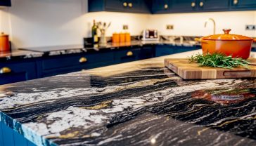
- If you have a highly patterned worktop (like a dramatic marble or granite), choose a simple, solid colour for your cabinets that picks out one of the tones in the stone.
- If you want a statement splashback with colourful, patterned tiles, your cabinets and worktop should be more restrained.
- Worktop Considerations:
- Wood: Adds warmth and texture. Pairs beautifully with greens, blues, creams, and dark greys.
- Laminate: Available in endless colours and patterns, offering a budget-friendly way to get the look of stone or wood.
- Quartz: A highly durable and non-porous option. A white or light grey marble-effect quartz is a classic choice that works with almost any cabinet colour.
- Granite: A natural stone with unique patterns. You should choose your cabinet colour after you have chosen your specific slab of granite, as the colours can vary so much.
- Flooring: Your floor is another large surface that needs to coordinate. A light-coloured floor can help to balance dark cabinets. A warm wood floor can prevent a white or grey kitchen from feeling too cold.
The Final Flourish: Hardware and Appliances
The handles, knobs, and taps are the jewellery of your kitchen. They can completely change the look of your cabinets.
- Hardware Metals:
- Brass/Gold: Adds warmth and a touch of luxury. Looks stunning against navy, green, black, and cream cabinets.
- Chrome/Nickel: A cool, contemporary choice that works well with grey, white, and blue cabinets.
- Black: Creates a modern, industrial, or minimalist look. Provides a sharp contrast on light cabinets and a subtle, sleek look on dark cabinets.
- Pewter/Aged Brass: Offers a softer, more traditional look, perfect for country or heritage-style kitchens.
- Appliances: Think about the colour of your appliances. Stainless steel is a versatile choice that goes with most colours. Some people prefer integrated appliances that are hidden behind cabinet doors for a seamless look. Alternatively, a statement range cooker in a bold colour can become a fantastic focal point.
Conclusion: Trust Your Instincts and Enjoy the Process
Choosing a kitchen cabinet colour is a big decision, but it doesn’t have to be a scary one. By working through the steps in this guide—understanding the light and space, thinking about your home’s style, and exploring the different colour families—you can narrow down your options with confidence.
Remember the golden rule: test, test, and test again. Get those sample pots and paint large pieces of card. Live with them in your kitchen for a few days and see how they make you feel.
Ultimately, the perfect colour is the one that you love. It’s the one that makes you smile when you walk in to make your morning tea. Trends will come and go, but a kitchen that reflects your personality and works for your life will bring you joy for many years to come. So trust your instincts, have fun with the process, and get ready to create a kitchen that is truly the heart of your home.
Further Reading & Resources
For more inspiration and to see these colours in real homes, check out these highly respected UK resources:
- Houzz UK: An incredible resource for viewing thousands of kitchen design projects from UK-based designers. https://www.houzz.co.uk/discussions/6139348/kitchen-colours
- Ideal Home: A fantastic British magazine and website full of practical advice and kitchen colour scheme ideas. https://www.idealhome.co.uk/all-rooms/kitchen
- Farrow & Ball: Explore their curated paint colours, many of which have become iconic choices for British kitchens. Their website offers plenty of inspiration. https://www.farrow-ball.com/paint-colours
- Little Greene: Another premium British paint manufacturer with a wonderful palette of heritage and contemporary colours. https://www.littlegreene.com/paint/colour
- deVOL Kitchens: A much-loved British kitchen designer whose work showcases beautiful and timeless colour choices. Their blog and galleries are a great source of inspiration. https://www.devolkitchens.co.uk