The Guide to Choosing the Perfect Kitchen Worktop Colour: 8 Expert Tips for a Flawless British Kitchen
Your complete guide to selecting the perfect kitchen worktop colour. Learn how to balance cabinets, flooring, light, and your lifestyle with 8 practical tips.
This post may contain affiliate links. If you make a purchase through these links, we may earn a commission at no additional cost to you.
The kitchen isn’t just a place to cook. It’s the buzzing hub of the modern British home. It’s where the day starts with a hurried slice of toast and a strong cuppa, where kids do their homework, and where friends gather over a bottle of wine. And at the very centre of it all, holding everything together, is the worktop. It’s the stage for every meal, every chat, and every creative mess.
Choosing a new kitchen is exciting, but let’s be honest, it can also be a bit terrifying. And nothing feels more permanent—or more pressure-packed—than picking the colour of your worktops. It’s a huge slab of material that you’re going to be looking at every single day for years. Get it right, and it ties the whole room together, making it feel polished, complete, and utterly yours. Get it wrong, and it can feel like a nagging mistake that throws everything else off-kilter.
But don’t panic. Choosing the right colour isn’t a dark art reserved for interior designers. It’s a process. By breaking it down and thinking about a few key things, you can move from feeling overwhelmed by endless samples to feeling confident and excited. This guide will walk you through eight simple, practical tips to help you find the perfect worktop colour for your home, your lifestyle, and your unique sense of style.
Why Your Worktop Colour is More Than Just a Pretty Face
Before we dive into the tips, it’s worth understanding just how much heavy lifting your worktop colour does. It’s not just about aesthetics; it’s about creating a feeling and a function.
- It Sets the Mood: Colour has a powerful psychological effect. Light, bright worktops can make a kitchen feel airy, clean, and energetic. Dark, dramatic colours can create a sense of sophistication, cosiness, and luxury. A warm, woody tone can feel rustic and welcoming. The colour you choose is the baseline for your kitchen’s entire personality.
- It Impacts the Feeling of Space: In the UK, we’re often working with kitchens that are more cosy than colossal. The right worktop colour can be a secret weapon in making your space feel bigger. Lighter shades reflect light, creating an illusion of space, while dark colours can make a small room feel a bit enclosed if not used carefully.
- It Affects Your Property’s Value: A well-designed kitchen is one of the biggest selling points of a home. A timeless, well-coordinated worktop choice can make your kitchen look high-end and thoughtfully designed, adding real value. A colour that’s too niche or dated might be off-putting to future buyers.
- It’s a Practical Partner: Some colours are simply more forgiving than others. A worktop that hides every crumb and water spot is a blessing in a busy family home, while a surface that shows every fingerprint might drive you mad.
Think of your worktop not just as a surface, but as the anchor of your entire kitchen design. Now, let’s get into the practical steps to choosing the right one.
The 8 Essential Tips for Choosing Your Perfect Kitchen Worktop Colour
Tip 1: Start with Your Cabinets – The Ultimate Power Couple
Your cabinets and your worktops are the two biggest visual elements in your kitchen. They sit right next to each other, so their relationship is the most important one to get right. You’re aiming for a partnership, not a clash. There are two main paths you can take: high contrast or gentle harmony.
The Golden Rule: Contrast or Complement?
- High Contrast: This is a bold, confident look that creates a clear visual separation. It’s about pairing light with dark. Think dark navy cabinets with a brilliant white worktop, or sleek white cabinets with a deep grey or black surface. This approach is fantastic for adding a touch of drama and making a design statement.
- Gentle Harmony (Complementary): This is a softer, more blended approach. It involves choosing colours that have similar tones or undertones. For example, pairing mid-grey cabinets with a light grey marbled worktop, or cream cabinets with a warm beige stone. This creates a calm, cohesive, and often more traditional feel.
Neither is ‘better’—it’s purely down to the look you’re going for.
Popular UK Cabinet Colours and Perfect Pairings
Let’s look at some of the most popular cabinet colours found in British kitchens and what worktops make them sing.
- For White or Cream Cabinets: You’re in luck—almost anything goes! This is your blank canvas.
- For a classic look: A black granite or dark grey quartz creates a timeless monochrome palette.
- For a modern, airy feel: A crisp, pure white quartz worktop makes the space feel enormous and clean. A white worktop with subtle grey veining adds a touch of luxury without being overpowering.
- For a warm, homely touch: A solid oak or walnut worktop brings in natural texture and stops an all-white kitchen from feeling too clinical.
- For Grey Cabinets (The Modern Classic): From soft dove grey to deep charcoal, grey is incredibly versatile.
- Light Grey Cabinets: These look fantastic with a dark worktop (like slate-effect laminate or dark grey quartz) for a bit of punch. A brilliant white worktop also works beautifully for a fresh, Scandi-inspired vibe.
- Dark Grey/Charcoal Cabinets: You almost always want to go lighter on the worktop here to avoid a cave-like feel. A white marble-effect quartz is a showstopper, as its veins can pick up the grey tones. A light concrete-effect worktop also looks brilliant for an industrial edge.
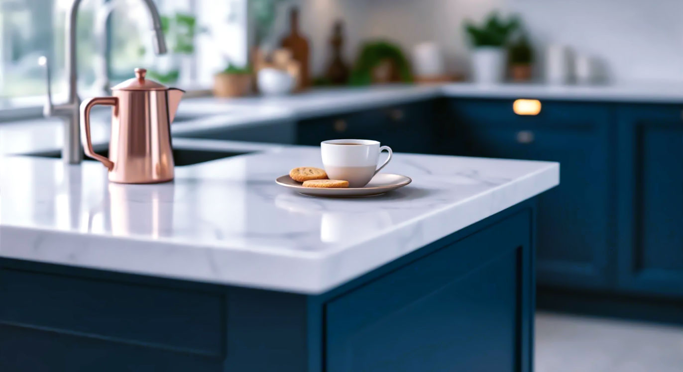
- For Navy or Dark Blue Cabinets: This enduringly popular choice screams affordable luxury.
- The Go-To: A crisp white or off-white worktop with grey or gold veining is the classic pairing. It’s clean, sophisticated, and lets the blue be the star.
- For a touch of warmth: A butcher’s block or solid wood worktop can look stunning, giving a slightly more rustic or nautical feel.
- For the brave: A brushed brass or copper-effect laminate can look incredibly glamorous, though it’s a bolder choice.
- For Sage Green or Earthy Tones: These kitchens are all about bringing the outside in.
- Natural partners: Creamy, warm-toned worktops in quartz or solid surface look beautiful. Solid wood is another no-brainer, enhancing the natural, organic feel.
- A surprising twist: A soft, light grey concrete-effect worktop can modernise the look and stop it from feeling too country.
Tip 2: Look Down! Don’t Forget Your Flooring
The floor is the third major surface in your kitchen, and it’s a classic mistake to forget about it until it’s too late. The worktop needs to have a conversation with the floor, even if they aren’t best friends.
Creating a Cohesive Foundation
You don’t want your worktop and floor to be an exact match, as this can look strange and flat. Instead, you’re looking for them to share a common undertone or to contrast nicely.
A good rule of thumb is the ‘three-layer cake’ idea. Imagine your cabinets, worktop, and floor as three layers. It often works best if two of them are similar in tone (e.g., light floor and light worktop with darker cabinets in between) or if all three are distinctly different but complementary shades (e.g., dark floor, mid-tone wood cabinets, light worktop). Avoid having three completely different, bold patterns or colours fighting for attention.
Matching Worktops with Different Floor Types
- Wooden Floors: Whether it’s original floorboards or modern LVT, wood floors bring warmth. They pair beautifully with almost any worktop. White, grey, or black worktops all look great. If you have a wooden worktop, try to ensure it’s either a significantly different shade from the floor or has a different grain pattern to avoid looking too ‘matchy-matchy’.
- Tile Floors (Patterned & Plain):
- If you have statement patterned tiles: Your worktop needs to be the quiet, supportive friend. Choose a solid colour, or one with a very subtle pattern, pulling one of the neutral shades from your tiles. A busy worktop with a busy floor is a recipe for a headache.
- If you have plain tiles: You have more freedom. A grey floor tile is a neutral base for almost anything. A warm terracotta or stone-coloured tile will look lovely with creamy or earthy worktops.
Tip 3: Let There Be Light (Or a Lack Thereof)
The amount of light your kitchen gets will completely change how a colour looks and feels. A colour that looks perfect in a bright, glossy showroom can look dull and gloomy in a north-facing kitchen on a drizzly Tuesday.
How Natural Light Transforms Colour
- North-Facing Kitchens: These rooms receive cooler, blue-toned light throughout the day. Dark or cool-toned worktops (like pure black or blue-grey) can feel very dark and energy-sapping in here. You might be better off choosing a worktop with warm undertones—think creams, beiges, or even a white with gold veining—to counteract the cool light.
- South-Facing Kitchens: These are flooded with warm, bright light all day. You can get away with almost any colour here! Darker colours won’t feel as oppressive, and cool whites and greys will look crisp and clean rather than chilly.
The Magic of Artificial Lighting
Don’t just look at your samples during the day. See how they look in the evening under your artificial lights.
- Warm LED lights will bring out the yellow and red tones in a worktop.
- Cool LED lights will highlight the blues and greys.
Under-cabinet lighting is particularly important as it shines directly onto the worktop. Make sure your sample looks good under that specific light source.
Gloss, Matte, or Honed? The Finish Matters
The finish of your worktop affects how it plays with light.
- Gloss/Polished: This finish reflects a lot of light, which can help make a small or dark kitchen feel brighter. The downside? It also reflects fingerprints and smudges more readily.
- Matte/Honed: This finish absorbs light, giving a softer, more contemporary look. It’s great for reducing glare in very bright kitchens and is often better at hiding daily smudges.
Tip 4: Match Your Kitchen’s Personality
Your worktop colour should feel like a natural fit for the overall style of your home. Think about the architectural style of your house and the aesthetic you’re trying to create.
What’s Your Kitchen’s Style?
- The Modern, Minimalist Kitchen: This style is all about clean lines and uncluttered surfaces. Think handleless cabinets and sleek appliances.
- Go-to colours: Crisp whites, solid greys, deep blacks. Patterns are usually minimal—a very subtle vein or a concrete/industrial texture works well. Pure white quartz or a slimline laminate in a solid colour is perfect.
- The Traditional Shaker or Country Kitchen: This style is warm, welcoming, and timeless, often found in period properties.
- Go-to colours: Natural materials are king here. Solid wood worktops (especially oak) are a classic choice. For stone, look for granite or quartz with soft, warm, natural patterns—creamy beiges, warm greys, and gentle marbled effects all work beautifully.
- The Industrial Look: Inspired by warehouses and factories, this style uses raw, honest materials.
- Go-to colours: Concrete is the hero. Look for concrete-effect quartz or high-quality laminate. Stainless steel is another option. Dark, textured worktops that look like slate or raw stone also fit the bill perfectly.
- The Scandi Vibe: This is a blend of modern and rustic—light, airy, and functional with a focus on natural textures.
- Go-to colours: Light woods (like birch or ash) and crisp, clean whites are the cornerstones of this look. A simple, unpatterned white or very light grey worktop is ideal.
Tip 5: Size Does Matter: Making Your Kitchen Feel Bigger
If you’re working with a smaller kitchen—like a galley kitchen in a Victorian terrace or a compact new-build—your worktop colour can be a powerful tool to enhance the sense of space.
Colours for a Small or Galley Kitchen
- Light and Bright is (Usually) Right: Lighter colours reflect light, which tricks the eye into seeing a larger, more open space. White, off-white, light grey, and pale beige are all fantastic choices. A consistent light colour across both worktops and cabinets can create a seamless look that really opens up a room.
- Go for Gloss: A polished or gloss-finish worktop will bounce light around the room, further enhancing that feeling of space.
- Don’t Be Afraid of Dark (If You’re Clever): While the general rule is to go light, a dark worktop can work in a small kitchen if the cabinets and walls are very light. This creates a strong, grounding contrast and can actually add depth. The key is to keep the dark colour limited to the worktop itself.
Using Patterns Wisely
In a small space, a very large, bold, and busy pattern can feel overwhelming and make the room feel cluttered. If you love a veined or marbled look, opt for a pattern with a smaller, more delicate design and a light-coloured background.
Tip 6: Think About Your Lifestyle (The Crumb Test)
A beautiful kitchen that’s impossible to keep clean is not a beautiful kitchen for long. Be brutally honest with yourself about how you live and cook.
For the Busy Family Home
If your kitchen is command central for kids, pets, and chaos, you need a worktop that’s forgiving.
- The Best Camouflage: Mid-tone colours with some form of pattern or speckle are your best friend. A speckled grey or beige granite or quartz is brilliant at hiding crumbs, dust, and water spots. They look clean even when they’re not perfectly pristine.
- Avoid: Solid, dark colours, especially in a gloss finish. They will show every single fingerprint, speck of dust, and smear. A pure white worktop can also be high-maintenance, as it will show every splash of bolognese or drop of coffee.
For the Meticulous Home Chef
If you’re a keen cook who cleans as they go, you can get away with more demanding surfaces. You might appreciate a pure white surface that shows you exactly where you need to wipe, or you might fall for the dramatic luxury of a polished black granite.
A simple test: take a sample of a dark gloss worktop and handle it for a minute. Then hold it up to the light. If the number of fingerprints makes you twitch, it’s not the right choice for you!
Tip 7: Get Hands-On with Samples
This might be the single most important tip in this entire guide. You cannot choose a worktop colour from a photo on a screen or a tiny 2-inch square in a showroom. It’s impossible.
Why You Can’t Trust a Screen
Every monitor and phone screen shows colour differently. The lighting in a showroom is designed to make everything look amazing. Your kitchen has its own unique light, its own wall colour, its own atmosphere. The only way to know how a colour will truly look is to see it in your space.
How to Test Samples Like a Pro
- Get the Biggest Sample You Can: A small sample won’t show you the full pattern repeat or give you a true sense of its impact. Ask for at least an A4-sized sample if possible. For materials like granite where every slab is unique, ask if you can see a photo of the actual slab you’ll be buying.
- Place it Vertically and Horizontally: Remember, your worktop is a horizontal surface, but you see it against your vertical cabinets. Prop your sample up against your cabinet doors to see how they interact.
- Check it Throughout the Day: Look at it in the bright morning light, in the flat afternoon light, and in the evening with your lights on. Colour changes dramatically.
- Test it with Your Other Elements: Place your flooring sample and a swatch of your wall paint colour next to the worktop sample. Do they all work together?
- Give it a (Gentle) Beating: Spill a bit of coffee or wine on it. Wipe it with a damp cloth. See how it feels to the touch and how easy it is to clean.
Tip 8: See the Bigger Picture and Think Timeless
Your worktop is just one piece of the puzzle. Step back and think about how it connects to everything else, and how you’ll feel about it in five or ten years.
Connecting the Dots: Splashbacks, Walls, and Appliances
- Splashback: This sits directly on top of your worktop, so it’s a key partner. If you want a statement splashback (like patterned tiles or a sheet of coloured glass), choose a simpler worktop. If you have a beautifully patterned worktop, a simple splashback (like a matching upstand, a plain glass sheet, or simple metro tiles) is often best.
- Wall Colour: Your walls surround the entire scene. It’s much easier to repaint a wall than to replace a worktop, so choose your worktop first and then find a paint colour that complements it.
- Appliances: Consider the finish of your oven, hob, and fridge. A stainless-steel finish works with most worktop colours. Black or white appliances might influence your decision towards creating either contrast or a more blended look.
Trend-Proofing Your Choice
Kitchen trends come and go. Right now, dramatic dark greens and heavily veined quartz are very popular. But will you still love them in a decade? If you’re concerned about longevity, it’s often wise to choose a classic, neutral colour for your worktop—the most expensive and difficult part to change. You can then bring in more fashionable colours through things that are easier and cheaper to update, like your wall paint, splashback, blinds, and accessories.
Timeless choices that rarely go out of style include:
- White marble-effect quartz
- Soft grey or beige stone effects
- Classic black granite
- Warm oak
A Quick Guide to Worktop Materials and Their Colours
The material you choose will influence your colour options. Here’s a quick rundown:
- Quartz: An engineered stone made from crushed quartz and resin. The biggest advantage is its consistency and range. You can get everything from pure, solid whites to incredibly realistic marble and concrete effects. It’s non-porous and very durable.
- Granite: A natural stone, meaning every single slab is unique. Colours range from speckled greys and blacks to exotic blues, greens, and reds. It offers a beautiful, one-of-a-kind look but needs to be sealed periodically.
- Marble: The height of luxury, known for its soft, beautiful veining. It’s a softer, more porous stone than granite, meaning it can stain and scratch more easily. Primarily available in whites and greys.
- Laminate: The budget-friendly champion. Modern high-pressure laminates offer incredibly realistic reproductions of stone, wood, and concrete, as well as endless solid colours. It’s less heat-resistant than stone.
- Wood: Offers natural warmth and character that gets better with age. Oak, walnut, and beech are popular. It requires regular oiling to keep it protected from water and stains.
Conclusion: Your Kitchen, Your Colour, Your Confidence
Choosing your kitchen worktop colour is a big decision, but it doesn’t need to be a stressful one. By working through these tips methodically, you can filter out the noise and focus on what truly works for your home and your life.
Start with your cabinets, consider your floor and the light in your room, and be honest about your lifestyle. Get physical samples and live with them for a few days. Trust your gut. This isn’t about finding the one ‘perfect’ colour that an expert would choose; it’s about finding the perfect colour for you. This is the backdrop to your daily life, so choose a colour that makes you happy every time you walk into the room to flick the kettle on.
Frequently Asked Questions (FAQs)
Should my worktops be lighter or darker than my cabinets? There’s no strict rule, but it’s the most common design choice. Dark cabinets with light worktops look crisp and open up the space. Light cabinets with dark worktops create a dramatic, grounded look. The key is to create a pleasing contrast that defines the two different surfaces.
What is the most popular kitchen worktop colour in the UK? Currently, shades of white and light grey remain incredibly popular, especially white quartz with subtle grey marbling. These colours are versatile, timeless, and help make kitchens feel bright and spacious. Dark colours, particularly deep greys and navy blues paired with white tops, are also a very strong trend.
What worktop colour is best for hiding dirt and crumbs? A mid-tone worktop with a speckled or multi-tonal pattern is the undisputed champion of hiding daily mess. Think of classic speckled granites or quartz composites in shades of grey or beige. They are exceptionally low-maintenance for busy households.
Are white worktops a bad idea? Not at all, but they require a bit more mindfulness. A solid white worktop will show every coffee ring and splash of curry, so you need to be diligent about wiping up spills quickly. A white worktop with a bit of a pattern or vein is much more forgiving. For material, white quartz is far more stain-resistant than white marble.
How do I match my splashback to my worktop? The simplest and most seamless option is to use the same material for your splashback as your worktop (or at least for a small upstand). If you’re using different materials, let one be the ‘star’. If you have a patterned worktop, choose a simple, plain splashback in a complementary colour. If your worktop is plain, you can afford to be more adventurous with a patterned tile or coloured glass splashback.
Further Reading
For more inspiration and to see these ideas in action, explore these excellent resources:
- Houzz UK: A vast library of real-life British kitchen designs and professional advice.
- Ideal Home: A fantastic resource for practical design tips and trend reports tailored to UK homes.
- Grand Designs Magazine: For those looking for bold, architectural inspiration and high-end materials.
- Pinterest: Create a mood board and search for specific combinations like “navy cabinets with white quartz” to see thousands of examples.